The CSS property that helps maintain spacing in responsive layouts.
Aspect ratio
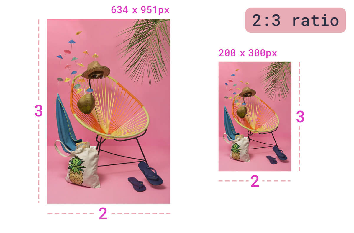
Aspect ratio is most commonly expressed as two integers and a colon in the dimensions of: width:height, or x:y. The most common aspect ratios for photography are 4:3 and 3:2, while video, and more recent consumer cameras, tend to have a 16:9 aspect ratio.

With the advent of responsive design, maintaining aspect ratio has been increasingly important for web developers, especially as image dimensions differ and element sizes shift based on available space.
Some examples of where maintaining aspect ratio become important are:
- Creating responsive iframes, where they are 100% of a parent's width, and the height should remain a specific viewport ratio
- Creating intrinsic placeholder containers for images, videos, and embeds to prevent re-layout when the items load and take up space
- Creating uniform, responsive space for interactive data visualizations or SVG animations
- Creating uniform, responsive space for multi-element components such as cards or calendar dates
- Creating uniform, responsive space for multiple images of varying dimension (can be used alongside
object-fit)
Object-fit
Defining an aspect ratio helps us with sizing media in a responsive context. Another tool in this
bucket is the object-fit property, which enables users to describe how an object (such an as image)
within a block should fill that block:

object-fit values. See demo on Codepen.The initial and fill values re-adjust the image to fill the space. In our example, this causes
the image to be squished and blurry, as it re-adjusts pixels. Not ideal. object-fit: cover uses
the image's smallest dimension to fill the space and crops the image to fit into it based on this
dimension. It "zooms in" at its lowest boundary. object-fit: contain ensures that the entire image
is always visible, and so the opposite of cover, where it takes the size of the largest boundary
(in our example above this is width), and resizes the image to maintain its intrinsic aspect ratio
while fitting into the space. The object-fit: none case shows the image cropped in its center
(default object position) at its natural size.
object-fit: cover tends to work in most situations to ensure a nice uniform interface when dealing
with images of varying dimensions, however, you lose information this way (the image is cropped at
its longest edges).
If these details are important (for example, when working with a flat lay of beauty products), cropping important content is not acceptable. So the ideal scenario would be responsive images of varying sizes that fit the UI space without cropping.
The old hack: maintaining aspect ratio with padding-top

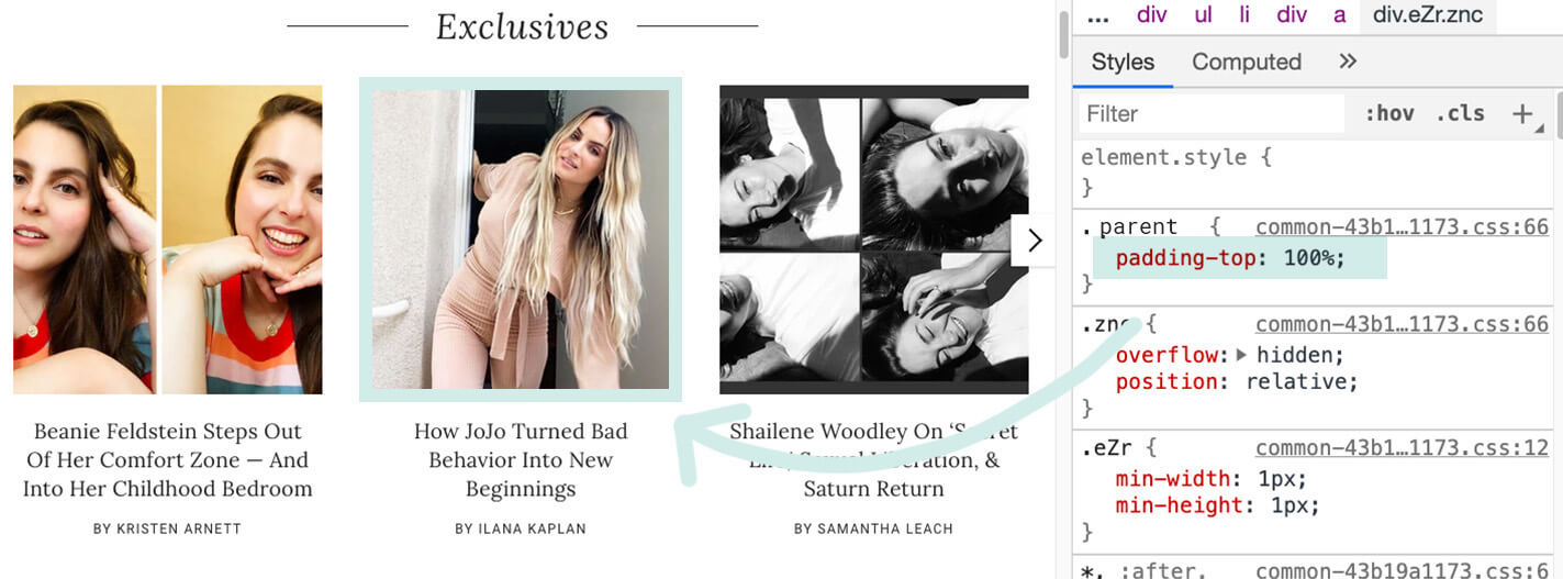
padding-top to set a 1:1 aspect ratio on post preview images within a carousel.In order to make these more responsive, we can use aspect ratio. This allows for us to set a specific ratio size and base the rest of the media on an individual axis (height or width).
A currently well-accepted cross-browser solution for maintaining aspect ratio based on an image's
width is known as the "Padding-Top Hack". This solution requires a parent container and an
absolutely placed child container. One would then calculate the aspect ratio as a percentage to set
as the padding-top. For example:
- 1:1 aspect ratio = 1 / 1 = 1 =
padding-top: 100% - 4:3 aspect ratio = 3 / 4 = 0.75 =
padding-top: 75% - 3:2 aspect ratio = 2 / 3 = 0.66666 =
padding-top: 66.67% - 16:9 aspect ratio = 9 / 16 = 0.5625 =
padding-top: 56.25%
Now that we have identified the aspect ratio value, we can apply that to our parent container. Consider the following example:
<div class="container">
  <img class="media" src="..." alt="...">
</div>
We could then write the following CSS:
.container {
  position: relative;
  width: 100%;
  padding-top: 56.25%; /* 16:9 Aspect Ratio */
}

.media {
  position: absolute;
  top: 0;
}
Maintaining aspect ratio with aspect-ratio

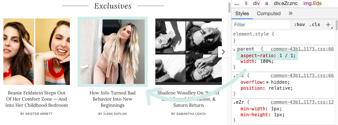
aspect-ratio to set a 1:1 aspect ratio on post preview images within a carousel.Unfortunately, calculating these padding-top values is not very intuitive, and requires some
additional overhead and positioning. With the new intrinsic aspect-ratio CSS
property, the language for maintaining aspect
ratios is much more clear.
With the same markup, we can replace: padding-top: 56.25% with aspect-ratio: 16 / 9, setting
aspect-ratio to a specified ratio of width / height.
.container {
  width: 100%;
  padding-top: 56.25%;
}
.container {
  width: 100%;
  aspect-ratio: 16 / 9;
}
Using aspect-ratio instead of padding-top is much more clear, and does not overhaul the padding
property to do something outside of its usual scope.
This new property also adds the ability to
set aspect ratio to auto, where "replaced elements with an intrinsic aspect ratio use that aspect
ratio; otherwise the box has no preferred aspect ratio." If both auto and a <ratio> are
specified together, the preferred aspect ratio is the specified ratio of width divided by height unless
it is a replaced element with
an intrinsic aspect ratio, in which case that aspect ratio is used instead.
Example: consistency in a grid
This works really well with CSS layout mechanisms like CSS Grid and Flexbox as well. Consider a list with children that you want to maintain a 1:1 aspect ratio, such as a grid of sponsor icons:
<ul class="sponsor-grid">
  <li class="sponsor">
    <img src="..." alt="..."/>
  </li>
  <li class="sponsor">
    <img src="..." alt="..."/>
  </li>
</ul>
.sponsor-grid {
  display: grid;
  grid-template-columns: repeat(auto-fill, minmax(120px, 1fr));
}

.sponsor img {
  aspect-ratio: 1 / 1;
  width: 100%;
  object-fit: contain;
}
Example: preventing layout shift
Another great feature of aspect-ratio is that it can create placeholder space to prevent
Cumulative Layout Shift and deliver better Web Vitals. In this first
example, loading an asset from an API such as Unsplash creates a
layout shift when the media is finished loading.
Using aspect-ratio, on the other hand, creates a placeholder to prevent this layout shift:
img {
  width: 100%;
  aspect-ratio: 8 / 6;
}
Bonus tip: image attributes for aspect ratio
Another way to set an image's aspect ratio is through image attributes. If you know the dimensions of the image ahead of time, it is a best practice to
set these dimensions as its width and height.
For our example above, knowing the dimensions are 800px by 600px, the image markup would look like: <img src="image.jpg"
alt="..." width="800" height="600">. If the image sent has the same aspect
ratio, but not necessarily those exact pixel values, we could still use image
attribute values to set the ratio, combined with a style of width: 100% so
that the image takes up the proper space. All together that would look like:
<!-- Markup -->
<img src="image.jpg" alt="..." width="8" height="6">
/* CSS */
img {
  width: 100%;
  height: auto;
}
In the end, the effect is the same as setting the aspect-ratio on the
image via CSS, and cumulative layout shift is avoided (see demo on
Codepen).
Conclusion
With the new aspect-ratio CSS property, launching across multiple modern browsers, maintaining proper
aspect ratios in your media and layout containers gets a little bit more straightforward.
Photos by Amy Shamblen and Lionel Gustave via Unsplash.

