A foundational overview of how to establish a dynamic and configurable color scheme
In this post I want to share thinking on ways to manage multiple color schemes in CSS. Try the demo.
If you prefer video, here's a YouTube version of this post:
Overview
We'll build an accessible color system with custom properties and calc(), to
make a webpage that's adaptive to user preferences while keeping the authoring
experience minimal. We start with a base brand color and build a system of
variants from it: 2 text colors, 4 surface colors and a matching shadow.
This guide begins with defining all of the colors for each color scheme up front. Not until the very end are they used to change the page.
The Brand
Often, a brand color has already been established and is delivered as
hex or
rgb. This GUI Challenge
has a base brand color of #0af. Firstly, for this color system, the hex value
needs converted to
hsl.
* {
  --brand: #0af;
  --brand: hsl(200 100% 50%);
}
In order to enable a concept of darkening or lightening the brand color, by say 20%, the 3 channels of the hsl color value need extracted into their own custom properties, like this:
* {
  --brand-hue: 200;
  --brand-saturation: 100%;
  --brand-lightness: 50%;
}
CSS can do math on those color properties, for example calc(var(--brand-lightness) -
20%) to decrease the lightness value by 20%. This is foundational to building a
color scheme as CSS can keep all colors in the same hue family by adjusting the
hsl saturation and lightness amounts.
Light theme
Each color variant will be marked with its matching scheme, in this case, each
is appended with -light.
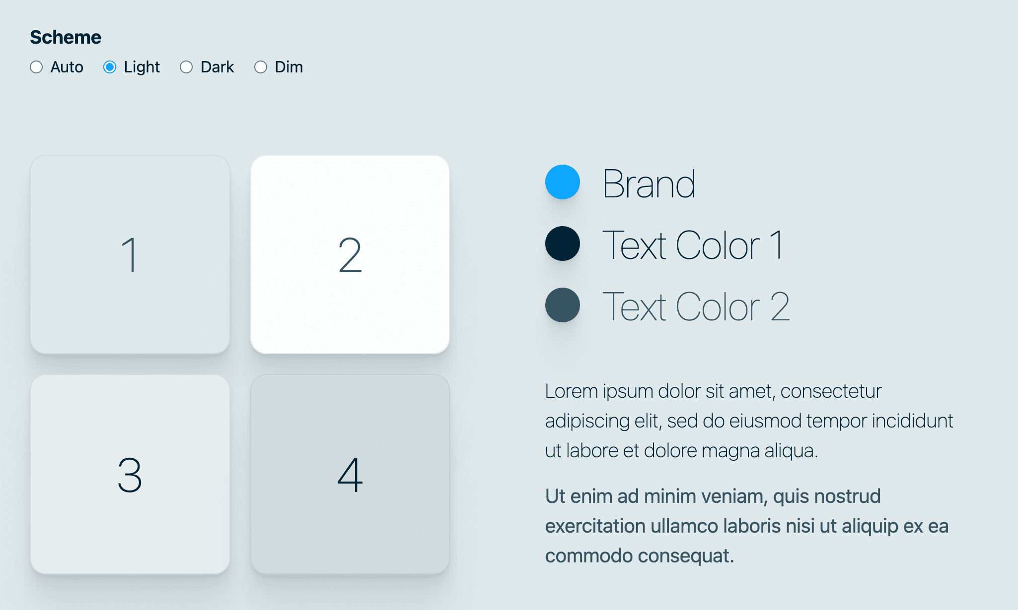
Brand
Starting with the brand color, it's rebuilt by wrapping --brand-hue, --brand-saturation
and --brand-lightness custom properties inside the hsl () function parenthesis,
without any calculations:
* {
  --brand-light: hsl(var(--brand-hue) var(--brand-saturation) var(--brand-lightness));
}
Text colors
Next, the essentials of a color scheme need text colors. In a light theme, text should be very dark. Notice how the lightness of the following colors is low, well under 50%.
* {
  --text1-light: hsl(var(--brand-hue) var(--brand-saturation) 10%);
  --text2-light: hsl(var(--brand-hue) 30% 30%);
}
--text1-light, since it's very dark at 10% lightness, keeps the heavy 100%
saturation so the brand color can still peek through into the dark dark navy.
--text2-light, it's not quite as dark as the 1st color, which is good as it's
a secondary color, and it's also much less saturated.
Surface colors
Surface colors are the backgrounds, borders and other decorative surfaces that text sits upon or within. In a light theme, these are the light colors, as opposed to the text colors which were dark. To create light colors with hsl, we'll use higher percentage values in the third lightness value. We'll also lower the saturation, so the light greys don't look too tinted.
* {
  --surface1-light: hsl(var(--brand-hue) 25% 90%);
  --surface2-light: hsl(var(--brand-hue) 20% 99%);
  --surface3-light: hsl(var(--brand-hue) 20% 92%);
  --surface4-light: hsl(var(--brand-hue) 20% 85%);
}
4 surface colors were created since decorative colors tend to need more
variants, for interactive moments like :focus or :hover or to create the
appearance of paper layers. In these scenarios, it's nice to transition
--surface2-light on hover to --surface3-light, so a hover results in an
increase of contrast (99% lightness to 92% lightness; making it darker).
Shadows
Shadows within a color scheme are above and beyond, but add a lifelike nature to the effect and help it stand out from unrealistic black based shadows. To do this, the color of the shadow will use the hue custom property, be slightly saturated with the hue but still very dark. Essentially building a very dark slightly blue shadow.
* {
  --surface-shadow-light: var(--brand-hue) 10% 20%;
  --shadow-strength-light: .02;
}
--surface-shadow-light is not wrapped in an hsl function. This is because the
--shadow-strength value will be combined to create some opacity, and CSS needs
the pieces in order to perform calculations. Skip to the rad shadow
section to learn more.
Light colors all together
No need to hunt around to find how any of the light colors are made, they are all in one place in the CSS.
* {
  --brand-light: hsl(var(--brand-hue) var(--brand-saturation) var(--brand-lightness));
  --text1-light: hsl(var(--brand-hue) var(--brand-saturation) 10%);
  --text2-light: hsl(var(--brand-hue) 30% 30%);
  --surface1-light: hsl(var(--brand-hue) 25% 90%);
  --surface2-light: hsl(var(--brand-hue) 20% 99%);
  --surface3-light: hsl(var(--brand-hue) 20% 92%);
  --surface4-light: hsl(var(--brand-hue) 20% 85%);
  --surface-shadow-light: var(--brand-hue) 10% calc(var(--brand-lightness) / 5);
  --shadow-strength-light: .02;
}

Dark theme
Most brands don't begin with a dark theme, it's a variant of their primary, usually lighter, theme. Users, on the other hand, often choose a dark theme for different contexts, like night time. These factors have led me to keeping two things in mind with dark themes:
- Users will generally be in the dark while using this theme, so test in the dark.
- Colors should desaturate as to not vibrate on the screen due to being over-intense.
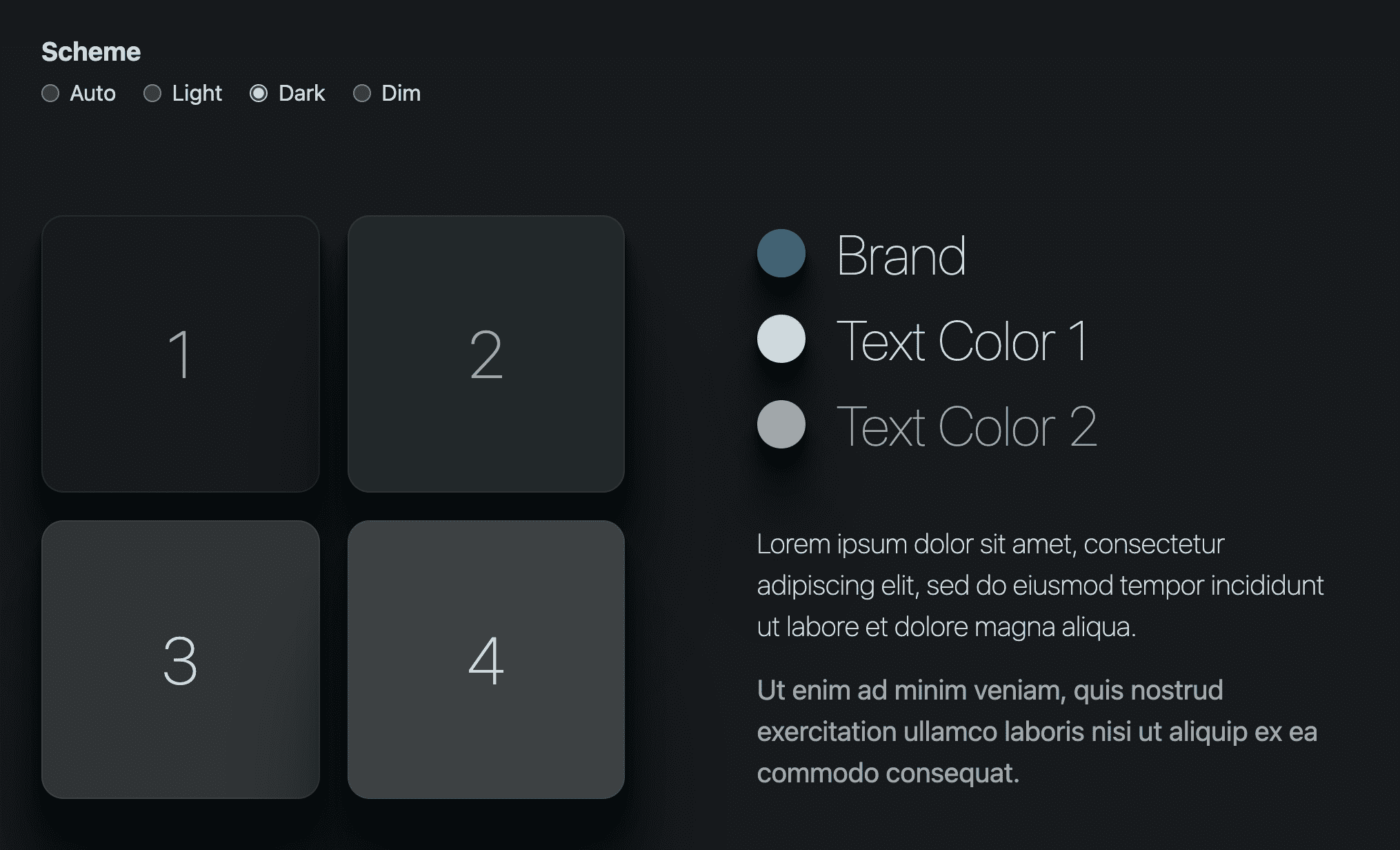
Brand
The light theme used the 3 brand hsl color channels values without alteration, the dark theme does not. The saturation is cut in half and the lightness reduced a relative 50%.
* {
  --brand-dark: hsl(
    var(--brand-hue)
    calc(var(--brand-saturation) / 2)
    calc(var(--brand-lightness) / 1.5)
  );
}
Text colors
In a dark theme, the text colors should be light. The following colors have high values for lightness, putting them closer to white.
* {
  --text1-dark: hsl(var(--brand-hue) 15% 85%);
  --text2-dark: hsl(var(--brand-hue) 5% 65%);
}
Surface colors
In a dark theme, the surface colors should be dark. The following colors have low lightness and saturation, with the 1st surface being the darkest at 10%.
* {
  --surface1-dark: hsl(var(--brand-hue) 10% 10%);
  --surface2-dark: hsl(var(--brand-hue) 10% 15%);
  --surface3-dark: hsl(var(--brand-hue) 5%  20%);
  --surface4-dark: hsl(var(--brand-hue) 5% 25%);
}
Shadows
In a dark theme, shadows can be very hard to see. Makes sense since it's hard to
darken something that's already fairly dark. This is where
--shadow-strength-dark comes in super handy as it allows us to darken the
shadows by changing one variable.
* {
  --surface-shadow-dark: var(--brand-hue) 50% 3%;
  --shadow-strength-dark: .8;
}
Also, look at how much saturation is in that shadow. Can you notice the color when you're looking at the interface? Try removing the saturation from the devtools, which do you prefer?!
Dark colors all together
* {
  --brand-dark: hsl(var(--brand-hue) calc(var(--brand-saturation) / 2) calc(var(--brand-lightness) / 1.5));
  --text1-dark: hsl(var(--brand-hue) 15% 85%);
  --text2-dark: hsl(var(--brand-hue) 5% 65%);
  --surface1-dark: hsl(var(--brand-hue) 10% 10%);
  --surface2-dark: hsl(var(--brand-hue) 10% 15%);
  --surface3-dark: hsl(var(--brand-hue) 5%  20%);
  --surface4-dark: hsl(var(--brand-hue) 5% 25%);
  --surface-shadow-dark: var(--brand-hue) 50% 3%;
  --shadow-strength-dark: .8;
}

Dim theme
This color scheme is all about orchestrating lightness and saturation. There should be enough saturation present to still have a hue visible, but should also just barely pass contrast scores since it's intended to be dim and low contrast anyway.
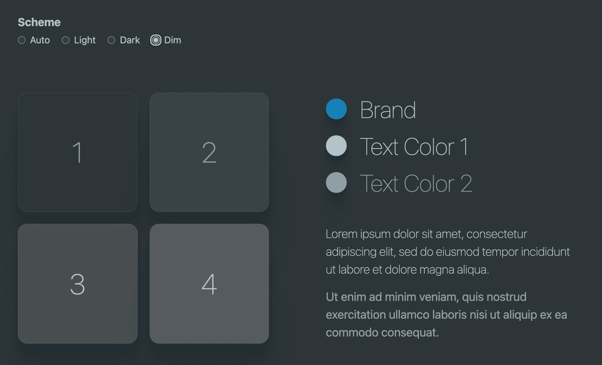
Brand
* {
  --brand-dim: hsl(
    var(--brand-hue)
    calc(var(--brand-saturation) / 1.25)
    calc(var(--brand-lightness) / 1.25)
  );
}
Text colors
* {
  --text1-dim: hsl(var(--brand-hue) 15% 75%);
  --text2-dim: hsl(var(--brand-hue) 10% 61%);
}
Surface colors
* {
  --surface1-dim: hsl(var(--brand-hue) 10% 20%);
  --surface2-dim: hsl(var(--brand-hue) 10% 25%);
  --surface3-dim: hsl(var(--brand-hue) 5%  30%);
  --surface4-dim: hsl(var(--brand-hue) 5% 35%);
}
Shadows
* {
  --surface-shadow-dim: var(--brand-hue) 30% 13%;
  --shadow-strength-dim: .2;
}
Dim colors all together
* {
  --brand-dim: hsl(var(--brand-hue) calc(var(--brand-saturation) / 1.25) calc(var(--brand-lightness) / 1.25));
  --text1-dim: hsl(var(--brand-hue) 15% 75%);
  --text2-dim: hsl(var(--brand-hue) 10% 61%);
  --surface1-dim: hsl(var(--brand-hue) 10% 20%);
  --surface2-dim: hsl(var(--brand-hue) 10% 25%);
  --surface3-dim: hsl(var(--brand-hue) 5%  30%);
  --surface4-dim: hsl(var(--brand-hue) 5% 35%);
  --surface-shadow-dim: var(--brand-hue) 30% 13%;
  --shadow-strength-dim: .2;
}

Accessible colors
Notice how the lowest lightness in the dark text color set is 65% and the highlest lightness in the dark surfaces is 25%. That's 40% of lightness breathing room between them. In the light theme, there's 55% breathing room in the light theme. Keeping lightness differences between text and surface colors at around 40-50% can help keep color contrast ratios high, while also being a subtle lever to adjust in case scores are poor.
I call it "bump bump til ya pass", which is the interaction of bumping the lightness value until a tool shows I'm passing.
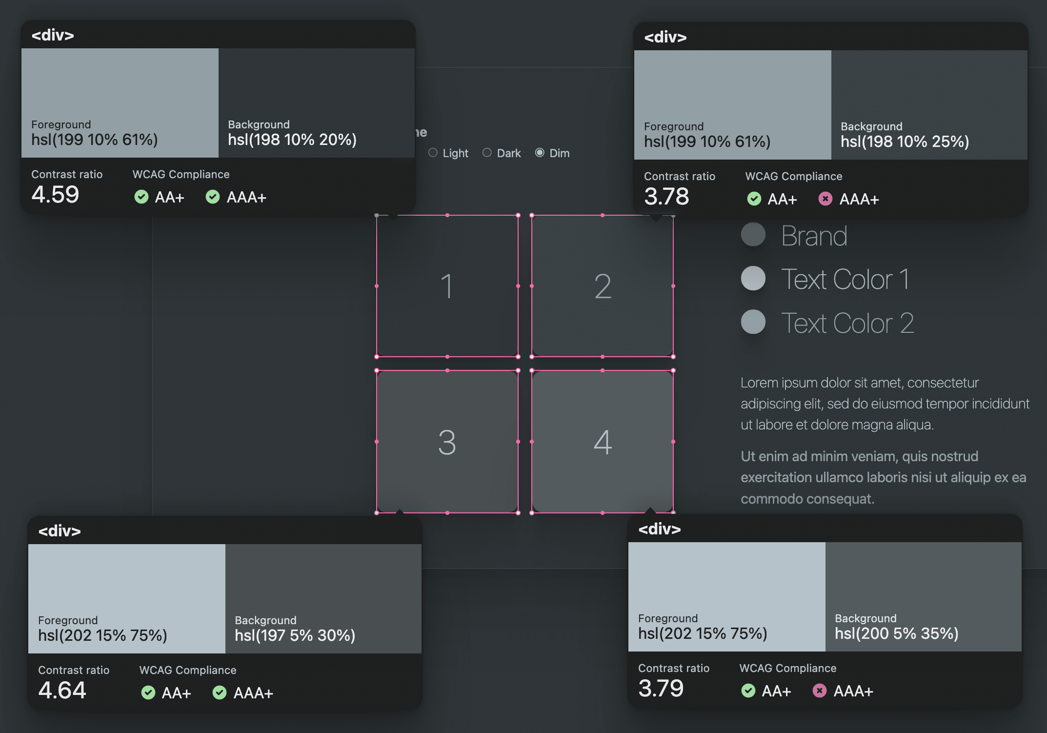
Each of the themes created in this challenge pass contrast scores. The dim color scheme has the lowest contrast of them, but still passes the minimum requirements. To help others on the team use good contrasting colors, it's a good idea to create a classname that pairs a surface color with an accessible text color.
.surface1 {
  background-color: var(--surface1);
  color: var(--text2);
}

.surface2 {
  background-color: var(--surface2);
  color: var(--text2);
}

.surface3 {
  background-color: var(--surface3);
  color: var(--text1);
}

.surface4 {
  background-color: var(--surface4);
  color: var(--text1);
}
Rad Shadow
The themes use a utility class called .rad-shadow. This shadow was generated
at this Smooth Shadow tool, which I appreciate very
much. I took its generated snippet and customized it with my own colors and,
opacity calculations. The reason for this was to create a shadow I could adjust
within each color scheme.
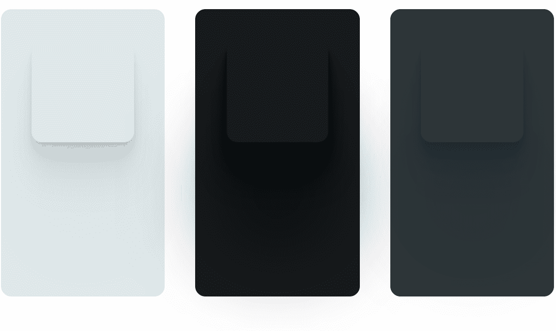
To accomplish this, I created 2 variables for each color scheme to adjust, a shadow color and a shadow strength. The color is for saturation and darkness adjustments, while the strength is for an easy way to drive up the shadow intensity when it's a dark color scheme. End result was something like this.
:root {
  --surface-shadow-light: var(--brand-hue) 10% 20%;
  --shadow-strength-light: .02;
}

.rad-shadow {
  box-shadow:
    0 2.8px 2.2px hsl(var(--surface-shadow) / calc(var(--shadow-strength) + .03)),
    0 6.7px 5.3px hsl(var(--surface-shadow) / calc(var(--shadow-strength) + .01)),
    0 12.5px 10px hsl(var(--surface-shadow) / calc(var(--shadow-strength) + .02)),
    0 22.3px 17.9px hsl(var(--surface-shadow) / calc(var(--shadow-strength) + .02)),
    0 41.8px 33.4px hsl(var(--surface-shadow) / calc(var(--shadow-strength) + .03)),
    0 100px 80px hsl(var(--surface-shadow) / var(--shadow-strength))
  ;
}
If I were to go further with shadows in my color scheme, I'd make the shadow angles a design token constant too, as the light direction should be the same between all the shadows of the design.
Using of the color schemes
With the predefining of colors complete, it's time to turn them into scheme agnostic properties. What I mean is, as a CSS author inside this color scheme project, one should rarely need to access a specific color scheme's value. I want to make it easy to stay within the theme.
To accomplish this, usage of the color scheme should be exclusively done through
the generic custom properties, which we'll be defining in a moment. This way,
folks using the design variables never need to worry about which color scheme is
currently set, they just need to use the surface and text colors. Instead of
color: var(--text1-light) use color: var(--text1). All adapting and pivoting
of colors is done much higher level in the CSS.
Diving in, the light theme's connective styles in the following code block,
connect a generic custom property with the light theme specific color. Now all
uses of var(--brand) will use the light brand color.
Light theme (auto)
:root {
  color-scheme: light;
  --brand: var(--brand-light);
  --text1: var(--text1-light);
  --text2: var(--text2-light);
  --surface1: var(--surface1-light);
  --surface2: var(--surface2-light);
  --surface3: var(--surface3-light);
  --surface4: var(--surface4-light);
  --surface-shadow: var(--surface-shadow-light);
  --shadow-strength: var(--shadow-strength-light);
}
The site is now using the light theme. This is a very fun successful moment! Let's have a few more of those moments as we use our predefined colors in other color scheme contexts.
Dark theme (auto)
@media (prefers-color-scheme: dark) {
  :root {
    color-scheme: dark;

    --brand: var(--brand-dark);
    --text1: var(--text1-dark);
    --text2: var(--text2-dark);
    --surface1: var(--surface1-dark);
    --surface2: var(--surface2-dark);
    --surface3: var(--surface3-dark);
    --surface4: var(--surface4-dark);
    --surface-shadow: var(--surface-shadow-dark);
    --shadow-strength: var(--shadow-strength-dark);
  }
}
Light theme
[color-scheme="light"] {
  color-scheme: light;

  --brand: var(--brand-light);
  --text1: var(--text1-light);
  --text2: var(--text2-light);
  --surface1: var(--surface1-light);
  --surface2: var(--surface2-light);
  --surface3: var(--surface3-light);
  --surface4: var(--surface4-light);
  --surface-shadow: var(--surface-shadow-light);
  --shadow-strength: var(--shadow-strength-light);
}
Dark theme
[color-scheme="dark"] {
  color-scheme: dark;

  --brand: var(--brand-dark);
  --text1: var(--text1-dark);
  --text2: var(--text2-dark);
  --surface1: var(--surface1-dark);
  --surface2: var(--surface2-dark);
  --surface3: var(--surface3-dark);
  --surface4: var(--surface4-dark);
  --surface-shadow: var(--surface-shadow-dark);
  --shadow-strength: var(--shadow-strength-dark);
}
Dim theme
[color-scheme="dim"] {
  color-scheme: dark;

  --brand: var(--brand-dim);
  --text1: var(--text1-dim);
  --text2: var(--text2-dim);
  --surface1: var(--surface1-dim);
  --surface2: var(--surface2-dim);
  --surface3: var(--surface3-dim);
  --surface4: var(--surface4-dim);
  --surface-shadow: var(--surface-shadow-dim);
  --shadow-strength: var(--shadow-strength-dim);
}
At this point, authors are free to use the provided color scheme generics as needed, and should never need to worry about themes again.
Conclusion
Now that you know how I did it, how would you?! 🙂
Let's diversify our approaches and learn all the ways to build on the web. Create a Codepen or host your own demo, tweet me with it, and I'll add it to the Community remixes section below.
Source
Community remixes
- @chris-kruining added a hue slider,
status colors and contrast modes for no-preference, more and less:
demo.

