So far in this course, you've learned about the individual, business, and legal aspects of digital accessibility, and the basics of digital accessibility conformance. You have explored specific topics related to inclusive design and coding, including when to use ARIA versus HTML, how to measure color contrast, when JavaScript is essential, amongst other topics.
In the remaining modules, we shift gears from designing and building to testing for accessibility. We share a three-step testing process that includes automated, manual, and assistive technology testing tools and techniques. We'll use the same demo throughout these testing modules to progress the web page from inaccessible to accessible.
Each test, automated, manual, and assistive technology, is critical to achieving the most accessible product possible. Our tests rely on the Web Content Accessibility Guidelines (WCAG) 2.1 conformance level A and AA as our standards.
Remember that your industry, product type, local and country laws and policies, or overall accessibility goals dictate which guidelines to follow and levels to meet. If you don't require a specific standard for your project, the recommendation is to follow the latest version of WCAG. Refer back to "How is digital accessibility measured?" for general information on accessibility audits, conformance types/levels, WCAG, and POUR.
As you now know, accessibility conformance is not the full story when it comes to supporting people with disabilities. But, it's a good starting point as it provides a metric you can test against. We encourage you to take the following actions in addition to conformance testing, to help you build more inclusive products:
- Run usability tests with people with disabilities.
- Hire people with disabilities to work on your team.
- Consult an individual or company with digital accessibility expertise.
Automated testing basics
Automated accessibility testing uses software to scan your digital product for accessibility issues against predefined accessibility conformance standards.
Advantages of automated accessibility tests:
- Quickly repeat tests at different stages of the product lifecycle.
- Just a few steps to run and very quick results.
- Little accessibility knowledge is required to run the tests or understand the results.
Disadvantages of automated accessibility tests:
- Automated tools don't catch all of the accessibility errors in your product
- Reported false positives (an issue is reported that isn't a true WCAG violation)
- Multiple tools may be needed for different product types and roles
Automated testing is a great first step to check your website or app for accessibility, but not all checks can be automated. We'll go into more detail on how to check the accessibility of elements that cannot be automated in the manual accessibility testing module.
Types of automated tools
One of the first online automated accessibility testing tools was developed in 1996 by the Center for Applied Special Technology (CAST), called "The Bobby Report." Today, there are over 100 automated testing tools to choose from!
Automated tool implementation varies from accessibility browser extensions to code linters, desktop and mobile applications, online dashboards, and even open-source APIs you can use to build your own automated tooling.
Which automated tool you decide to use can depend on many factors, including:
- Which conformance standards and levels are you testing against? This may include WCAG 2.2, WCAG 2.1, U.S. Section 508, or a modified list of accessibility rules.
- What type of digital product are you testing? This could be a website, web app, native mobile app, PDF, kiosk, or other product.
- What part of the software development lifecycle are you testing your product?
- How much time does it take to set up and use the tool? For an individual, team, or company?
- Who is conducting the test: designers, developers, QA, or someone else?
- How often do you want the accessibility to be checked? What details should be included in the report? Should issues be directly linked to a ticketing system?
- Which tools work best in your environment? For your team?
There are many additional factors to consider as well. Check out WAI's article on "Selecting Web Accessibility Evaluation Tools" for more information on how to select the best tool for you and your team.
Demo: Automated test
For the automated accessibility testing demo, we'll be using Chrome's Lighthouse. Lighthouse is an open-source, automated tool created to improve the quality of web pages through different types of audits, such as performance, SEO, and accessibility.
Our demo is a website built for a made-up organization, the Medical Mysteries Club. This site is intentionally made inaccessible for the demo. Some of this inaccessibility may be visible to you, and some (but not all) will be caught in our automated test.
Step 1
Using your Chrome browser, install the Lighthouse extension.
There are many ways to integrate Lighthouse into your testing workflow. We use the Chrome extension for this demo.
Step 2
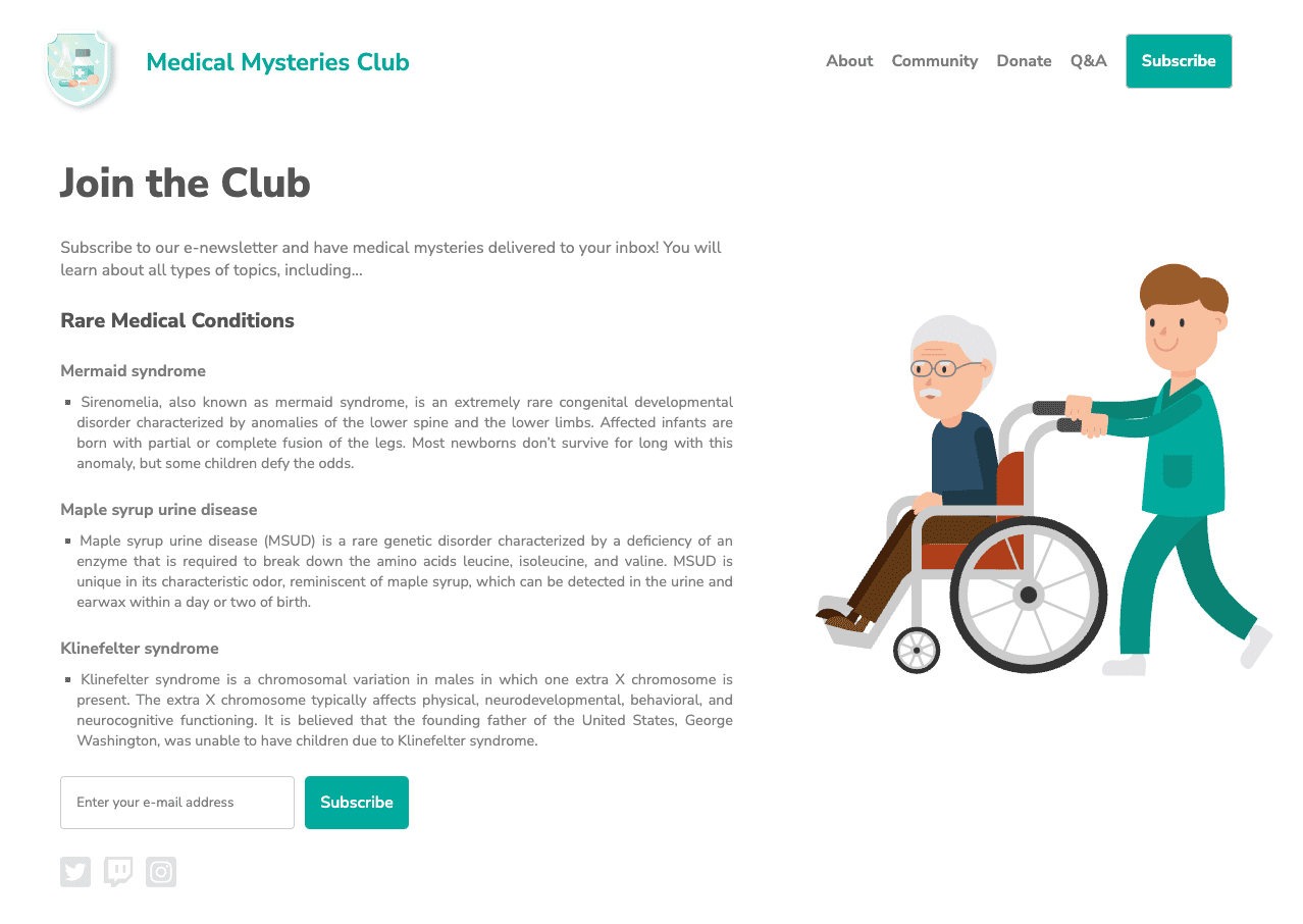
We built a demo in CodePen.
View it in debug mode to proceed with the
next tests. This is important, as it removes the <iframe> which surrounds the
demo web page, which may interfere with some testing tools.
Learn more about CodePen's debug mode.
Step 3
Open Chrome DevTools and navigate to the Lighthouse tab. Clear all of the category options except for "Accessibility." Keep the mode as the default and choose the device type you're running the tests on.
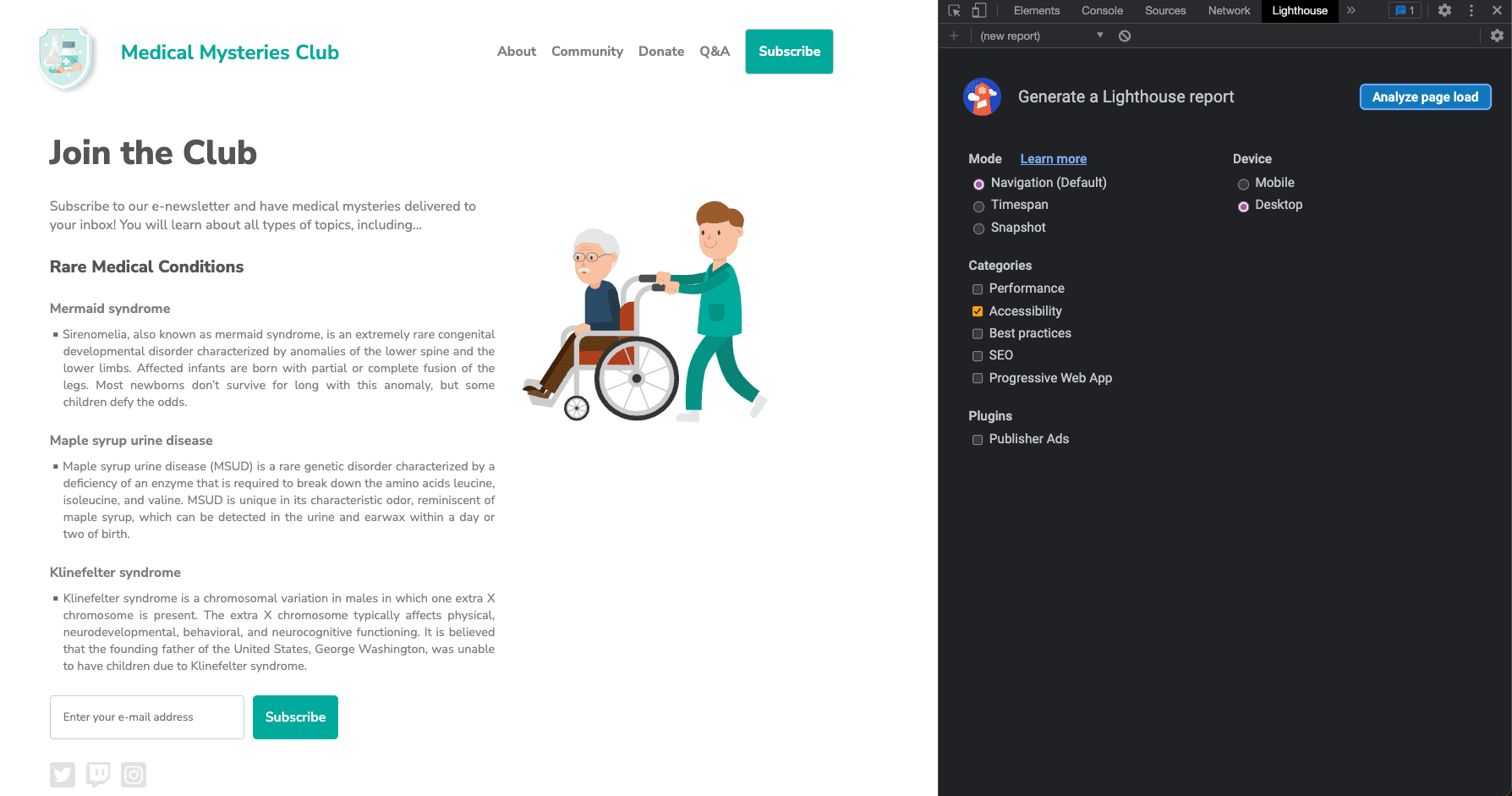
Step 4
Click Analyze page load and give Lighthouse time to run its tests.
Once the tests are complete, Lighthouse displays a score that measures how accessible the product you're testing is. The Lighthouse score is calculated by the number of issues, issue types, and the impact on users of the issues detected.
Beyond a score, the Lighthouse report includes detailed information about what issues it has detected and links to resources to learn more about remedying them. The report also includes tests that are passed or not applicable and a list of additional items to check manually.
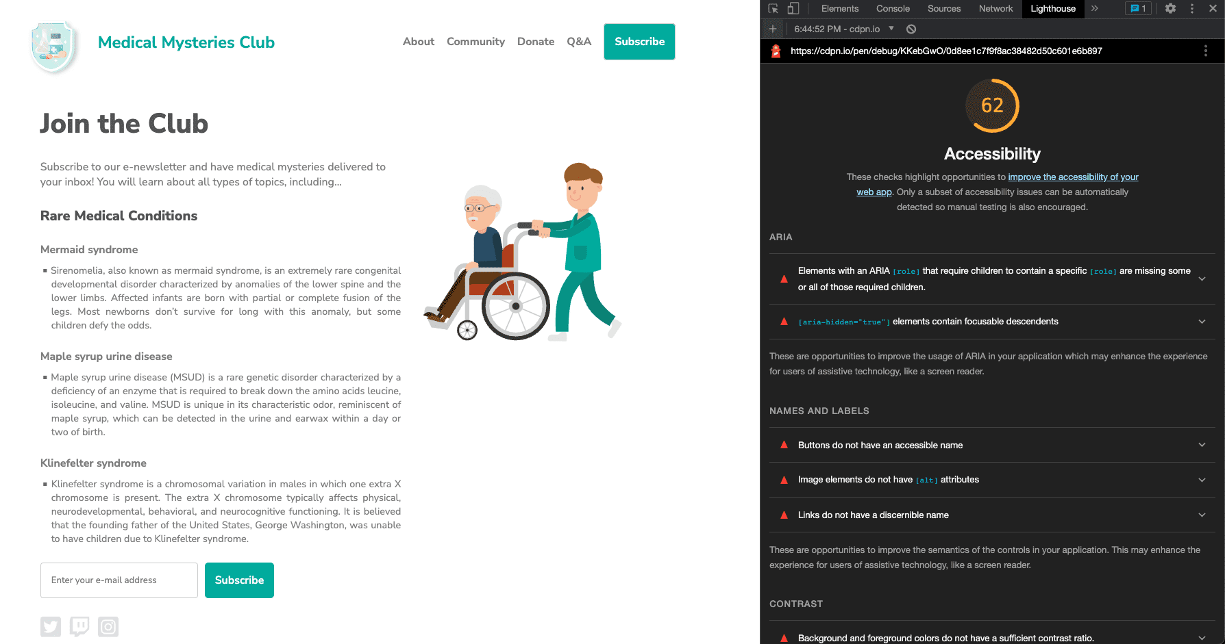
Step 5
Now, go through an example of each automated accessibility issue discovered and fix the relevant styles and markup.
Issue 1: ARIA roles
The first issue states: "Elements with an ARIA [role] that require children to
contain a specific [role] are missing some or all of those required children.
Some ARIA parent roles must contain specific child roles to perform their
intended accessibility functions."
Learn more about ARIA role rules.
In our demo, the newsletter subscribe button fails:
<button role="list" type="submit" tabindex="1">Subscribe</button>
 Let's fix it.
The "subscribe" button next to the input field has an incorrect ARIA role applied to it. In this case, the role can be removed completely.
<button type="submit" tabindex="1">Subscribe</button>
Issue 2: ARIA hidden
"[aria-hidden="true"] elements contain focusable descendants. Focusable
descendants within an [aria-hidden="true"] element prevent those interactive
elements from being available to users of assistive technologies like screen
readers. Learn more about aria-hidden rules.
<input type="email" placeholder="Enter your e-mail address" aria-hidden="true" tabindex="-1" required>
 Let's fix it.
The input field had an aria-hidden="true" attribute applied to it. Adding
this attribute hides the element (and everything nested under it) from
assistive tech.
<input type="email" placeholder="Enter your e-mail address" tabindex="-1" required>
In this case, you should remove this attribute from the input to allow people using assistive technology to access and enter information into the form field.
Issue 3: Button name
Buttons don't have an accessible name. When a button doesn't have an accessible name, screen readers announce it as "button," making it unusable for users who rely on screen readers.
Learn more about button name rules.
<button role="list" type="submit" tabindex="1">Subscribe</button>
 Let's fix it.
When you remove the inaccurate ARIA role from the button element in issue 1, the word "Subscribe" becomes the accessible button name. This functionality is built into the semantic HTML button element. There are additional pattern options to consider for more complex situations.
<button type="submit" tabindex="1">Subscribe</button>
Issue 4: Image alt attributes
Image elements are missing [alt] attributes. Informative elements should aim
for short, descriptive alternate text. Decorative elements can be ignored with
an empty alt attribute. Learn more about image alternative text
rules.
<a href="index.html">
  <img src="https://upload.wikimedia.org/wikipedia/commons/….png">
</a>
 Let's fix it.
Since the logo image is also a link, you know from the image module that it's called an actionable image and requires alternative text information about the purpose of the image. Normally, the first image on the page is a logo, so you can reasonably assume your AT users will know this, and you may decide not to add this additional contextual information to your image description.
<a href="index.html">
  <img src="https://upload.wikimedia.org/wikipedia/commons/….png"
    alt="Go to the home page.">
</a>
Issue 5: Link text
Links don't have a discernible name. Link text (and alternate text for images, when used as links) that is discernible, unique, and focusable improves the navigation experience for screen reader users. Learn more about link text rules.
<a href="#!"><svg><path>...</path></svg></a>
 Let's fix it.
All of the actionable images on the page must include information about where
the link sends users. One method to remedy this issue is to add alternative
text to the image about the purpose, as you did on the logo image in the
example. This works great for an image using a <img> tag, but <svg>
tags cannot use this method.
For the social media icons, which use <svg> tags, you can use a
different alternative description pattern
targeting SVGs, add the information between the <a> and <svg> tags and then
hide it visually from users, add a supported ARIA, or other options. Depending
on your environment and code restrictions, one method might be preferable over
another.
Use the simplest pattern option with the most assistive
technology coverage, which is adding a role="img" to the <svg> tag and
including a <title> element.
<a href="#!">
  <svg role="img">
    <title>Connect on our Twitter page.</title>
    <path>...</path>
  </svg>
</a>
Issue 6: Color contrast
Background and foreground colors don't have a sufficient contrast ratio. Low-contrast text is difficult or impossible for many users to read. Learn more about color contrast rules.
Two examples were reported.
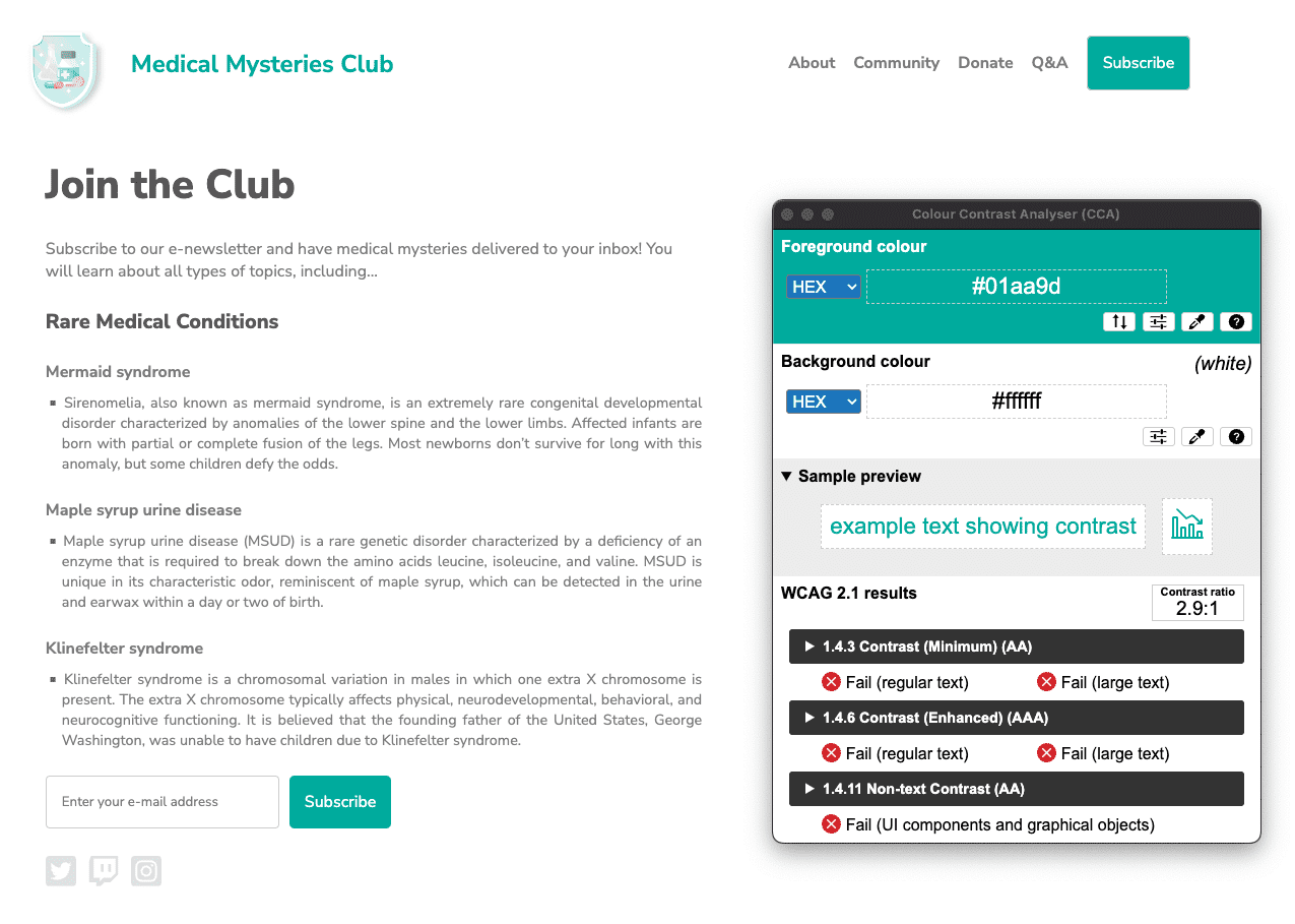
#01aa9d and the background hex value of #ffffff.
The color contrast ratio is 2.9:1. 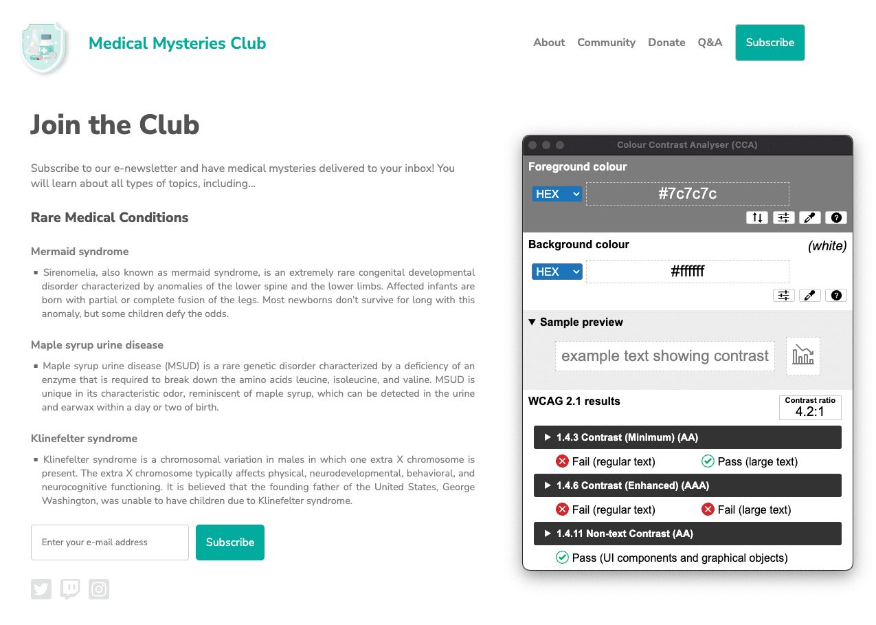
#7c7c7c, while the
background's hex color is #ffffff. The color contrast ratio
is 4.2:1.
 Let's fix it.
There are many color contrast issues detected on the web page. As you learned in the color and contrast module, regular-sized text (less than 18pt / 24px) has a color contrast requirement of 4.5:1, while large-sized text (at least 18pt / 24px or 14pt / 18.5px bold) and essential icons must meet the 3:1 requirement.
For the page title, the teal-colored text needs to meet the 3:1 color contrast requirement since it's large-sized text at 24px. However, the teal buttons are considered regular-sized text at 16px bold, so they must meet the 4.5:1 color contrast requirement.
In this case, we could find a teal color that was dark enough to meet 4.5:1, or we could increase the size of the button text to 18.5px bold and change the teal color value slightly. Either method stays in line with the design aesthetics.
All the gray text on the white background also fails for color contrast, except for the two largest headings on the page. This text must be darkened to meet the 4.5:1 color contrast requirements.
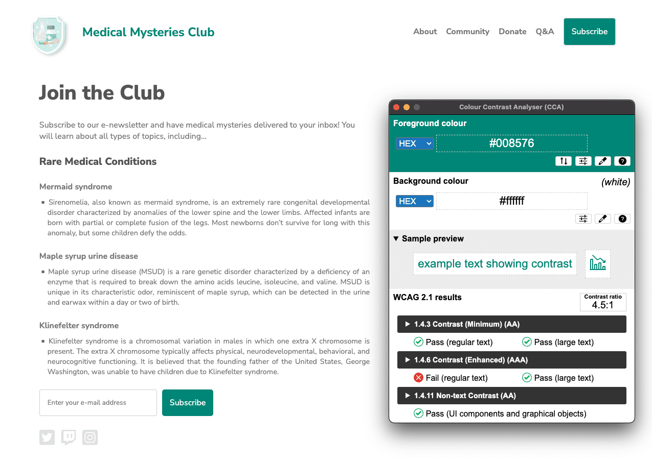
#008576 and the background remains #ffffff. The
updated color contrast ratio is 4.5:1. Click the image to view full-size.
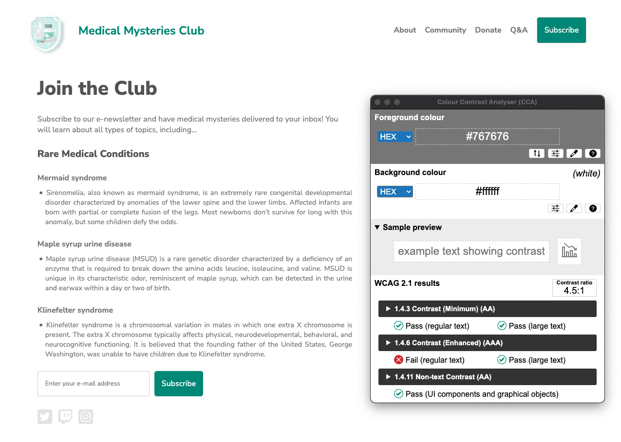
#767676 and the
background remains #ffffff. The color contrast ratio is 4.5:1.
Issue 7: list structure
List items (<li>) are not contained within <ul> or <ol> parent elements.
Screen readers require list items (<li>) to be contained within a parent
<ul> or <ol> to be announced properly.
<div class="ul">
  <li><a href="#">About</a></li>
  <li><a href="#">Community</a></li>
  <li><a href="#">Donate</a></li>
  <li><a href="#">Q&A</a></li>
  <li><a href="#">Subscribe</a></li>
</div>
 Let's fix it.
We used a CSS class in this demo to simulate the unordered list instead of
using a <ul> tag. When we wrote this code improperly, we removed the inherent
semantic HTML features built into this tag. By replacing the class with a real
<ul> tag and modifying the related CSS, we resolve this accessibility issue.
<ul>
  <li><a href="#">About</a></li>
  <li><a href="#">Community</a></li>
  <li><a href="#">Donate</a></li>
  <li><a href="#">Q&A</a></li>
  <li><a href="#">Subscribe</a></li>
</ul>
Issue 8: tabindex
Some elements have a tabindex value greater than 0. A value greater than 0
implies an explicit navigation ordering. Although technically valid, this often
creates frustrating experiences for users who rely on assistive technologies.
Learn more about tabindex rules.
<button type="submit" tabindex="1">Subscribe</button>
 Let's fix it.
Unless there is a specific reason to disrupt the natural tabbing order on a web
page, there is no need to have a positive integer on a tabindex attribute. To
keep the natural tabbing order, we can either change the tabindex to 0 or
remove the attribute altogether.
<button type="submit">Subscribe</button>
Step 6
Now that you've fixed all the automated accessibility issues, open up a new debug mode page. Run the Lighthouse accessibility audit again. Your score should be much better than on the first run.
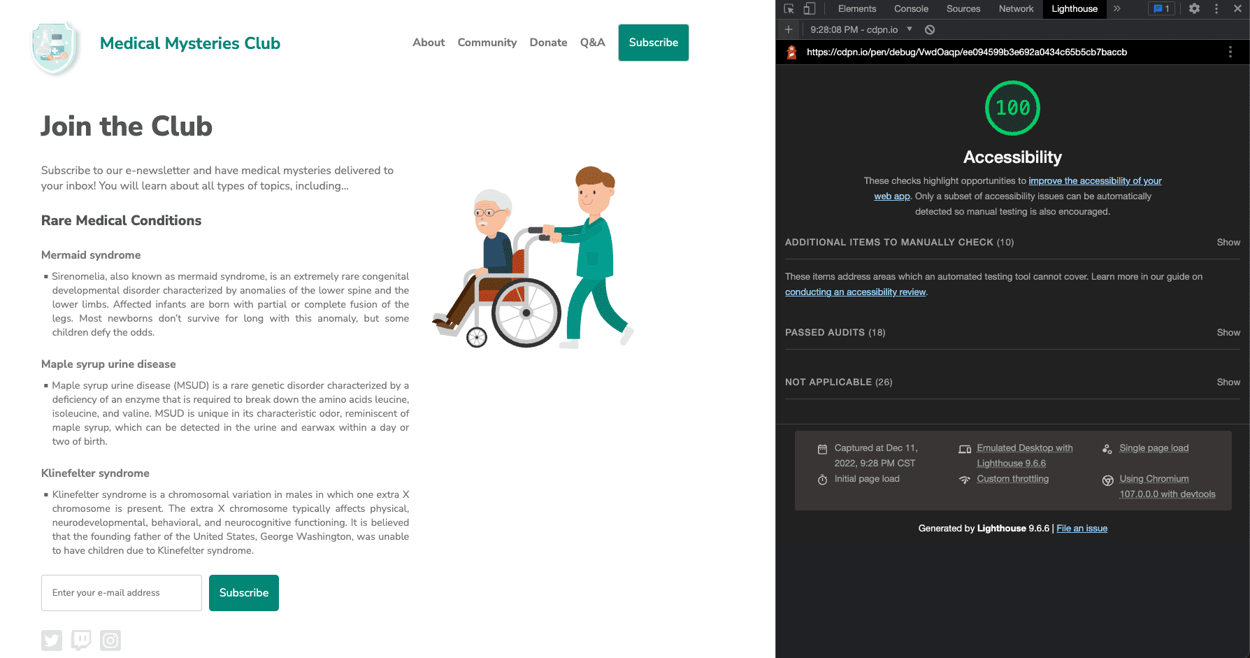
We've applied all of these automated accessibility updates to a new CodePen.
Next step
Great job. You have accomplished a lot already, but we haven't finished yet! Next, we'll move on to manual checks, as detailed in the manual accessibility testing module.
Check your understanding
Test your knowledge of automated accessibility testing.
What kind of testing should you do to ensure that your site is accessible?
What errors are caught in automated testing?
