As you learned in links, the <a> element with the href
attribute creates links that users can follow by clicking or
tapping. In lists, you learned how to create lists of
content. In this module, you discover how to group lists of
links together to create navigation.
There are several types of navigation and several ways to display them. Named anchors within text that link to other pages within the same website are considered local navigation. Local navigation that consists of a series of links, displaying the hierarchy of the current page in relation to the site's structure, or the pages the user followed to get to the current page, is called a breadcrumb.
A page's table of contents is another type of local navigation. A page containing hierarchical links to every single page on a site is called a site map. The navigation leading to the top-level pages of the website, which is likely found on every page, is called global navigation. Global navigation can be displayed in several different ways, including navigation bars, drop-down menus, and flyout menus. The same site may display its global navigation differently, depending on the viewport size.
Always make sure users can navigate to any page on your site with the fewest number of clicks, while making sure the navigation is intuitive and not overwhelming. That said, there are no specific requirements for navigational elements. MachineLearningWorkshop.com, being a single-page website, has a local navigation bar in the top right; this is where multi-page sites often put their global navigation.

"Skip to content" link
Some sites feature a "skip to content" link, often as the first element in the focus order. It may look something like:
<a href="#main" class="skip-link button">Skip to main</a>
When clicked or when it has focus and the user hits Enter, it scrolls the page
and gives focus to the element with a main ID, presumably the main content.
<main id="main">
For improved usability and accessibility, it's important to let users bypass the
blocks of content that are repeated on every page, such as a shared heading
and main navigation items. With a skip link, when a keyboard user hits tab,
they can quickly go to the new content on the page. This lets them avoid having
to tab through an extensive menu.
Most designers don't like the appearance of having such a link at the top of the page. It's fine to hide that link from view. However, remember that when the link gets focus, which happens when a keyboard user tabs through the link on the page, the link must be visible to the user.
Only hide content in a non-focused and non-active state using a selector similar
to .visually-hidden:not(:focus):not(:active).
Like all link text, the name should clearly indicate where the link takes the user. The link target should be the beginning of the page's main content.
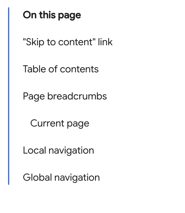
Table of contents
The first element of our main content is the <h1> heading with the title of
this page: <h1>Navigation</h1>. The main heading is
followed by a brief description of the contents of this tutorial.

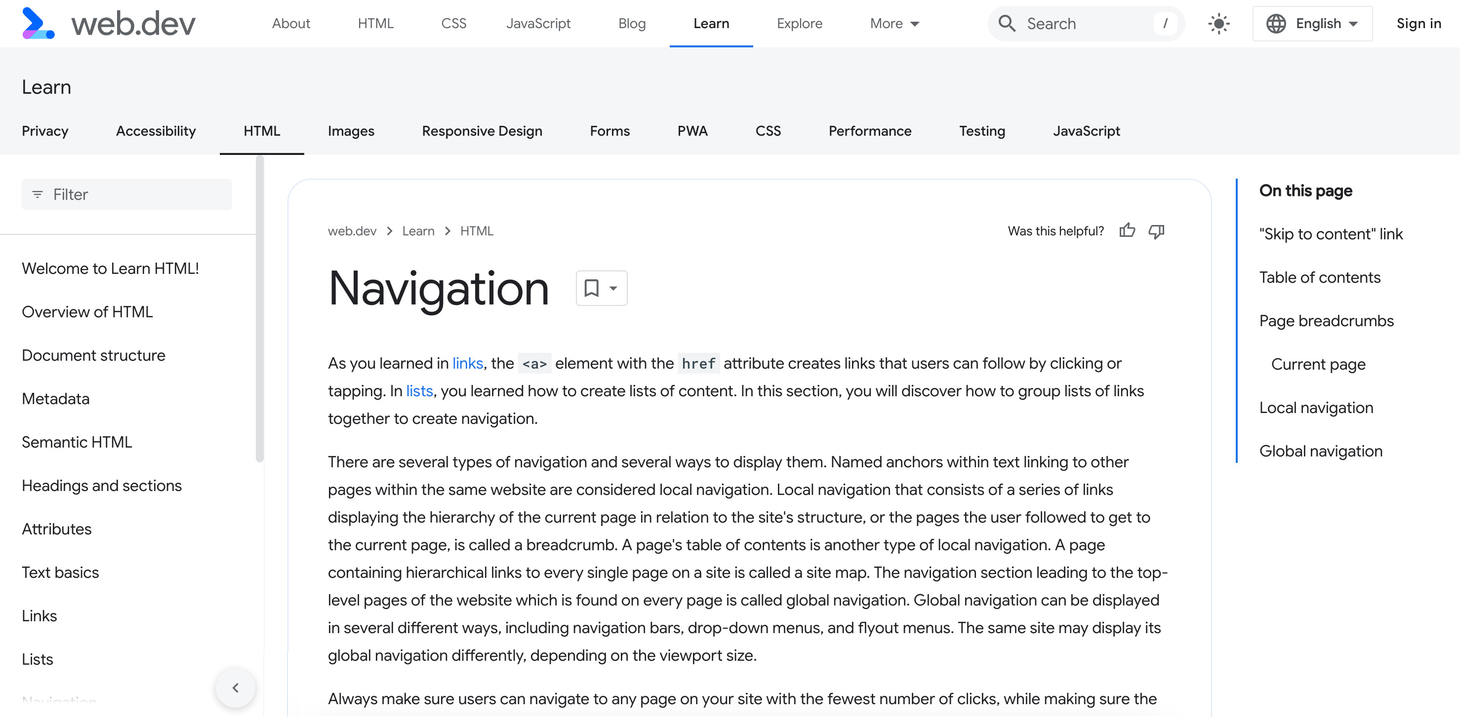
On smaller screens, the table of contents appears after the heading. On larger screens, it's presented in a right-aligned sidebar.
The best element to use for navigation sections is <nav>. It
automatically informs the screen reader and search engine that a section has a
role of navigation, a landmark role.
Include the aria-label
attribute for a brief description of the purpose of the navigation. In this
case, as the value of that attribute would be redundant to the text "On this
page." To reference visible text, instead use
aria-labelledby.
Using an id, that could look as follows:
<nav aria-labelledby="tocTitle">
  <p id="tocTitle">On this page</p>
...
</nav>
In addition to reducing redundancy, visible text gets translated by translation services, whereas attribute values may not. When possible, if text is present that provides for an adequate label, refer to that text instead of using attribute text.
The "On this page" navigation is the table of contents. If you want to use
aria-label, provide that context rather than repeating visible text:
<nav aria-label="Table of Contents">
  <p>On this page</p>
...
</nav>
To provide an accessible name on an element, you should not include the name
of the element. Screen readers provide the name of the element to the user.
For example, when using the <nav> element, don't include the word
"navigation," as that information is already included with semantic elements.
While navigation items don't have to be nested in a list, using a list enables screen reader users to know how many list items, and therefore links, are in the navigation.
<nav aria-labelledby="tocTitle">
  <p id="tocTitle">On this page</p>
  <ul role="list">
    <li>
      <a href="#skip">Skip to content link</a>
    </li>
    <li>
      <a href="#toc">Table of contents</a>
    </li>
    <li>
      <a href="#bc">Page breadcrumbs</a>
    </li>
    <li>
      <a href="#ln">Local navigation</a>
    </li>
    <li>
      <a href="#global">Global navigation</a>
    </li>
  </ul>
</nav>
Avoid changing tab order
The table of contents may appear after the heading, on smaller screens, or in a right-aligned sidebar. Including two identical sets of navigation, only to show one, would be an anti-pattern.
We've used CSS to display the navigation as a sidebar on pages that are wider than 1254px.
While users are accustomed to content being responsive and changing location when they change devices or increase their font size, they don't expect the tab order to change when they do so. Page layouts should be accessible, predictable, and consistent across a site. Here, the location of the table of contents is not predictable.
Page breadcrumbs
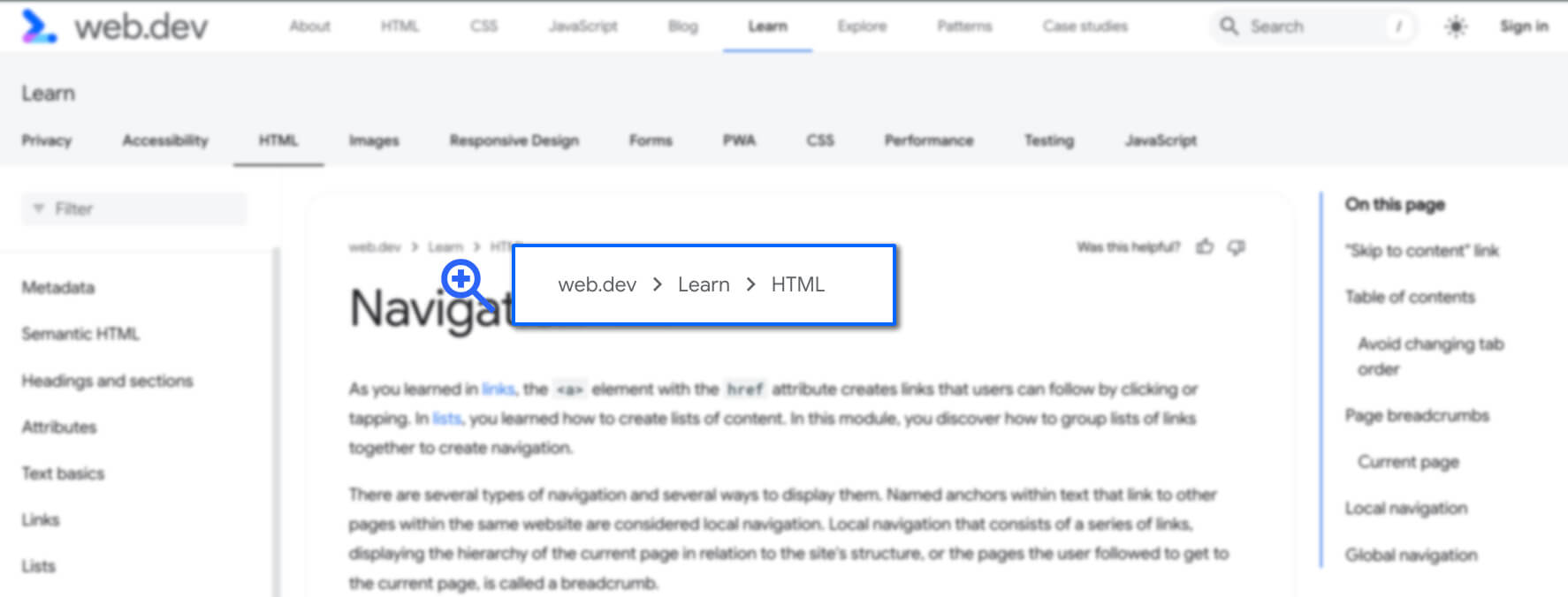
Breadcrumbs provide secondary navigation to help users understand where they are on a website. Breadcrumbs generally indicate the URL hierarchy of the current document and the location of the current page within the site structure.
The site structure from a user perspective may differ from the file structure on the server, and that's fine. The user doesn't need to know how you organize your files, but they do need to be able to navigate through your content.
Breadcrumbs offer users insight into the organization of your site. This helps
users navigate to any ancestor sections, without having to go back through every
previously visited page, using the back function.
If the site has a hierarchical directory structure, as is the case with web.dev, the breadcrumb navigation often includes a link to the homepage or hostname and a link to the index file of each directory in the URL path. Including the current page is optional and requires a little extra attention.
const url = new URL("https://web.dev/learn/html/navigation");
const sections = url.hostname + url.pathname.split('/');
// "web.dev,learn,html,navigation"
The sections of the breadcrumb show the path from the current page back to the home page, showing each level in-between.

Every Learn HTML module page has the same breadcrumb navigation, displaying the
hierarchy of the HTML lessons within the Learn section of web.dev.
The code should be similar to the following:
<nav aria-label="breadcrumbs">
  <ol role="list">
    <li>
      <a href="/">web.dev</a>
    </li>
    <li>
      <a href="/learn">Learn</a>
    </li>
    <li>
      <a href="/learn/html">HTML</a>
    </li>
  </ol>
</nav>
The <nav> element, a landmark role, tells assistive technology to present the
breadcrumbs as a navigational element on the page.
The accessible name of "breadcrumbs", provided with the aria-label,
differentiates this navigation from the other navigation landmarks, in the same
document.
Between each link is a content separator. These separators could be generated with CSS, to display before each list item, starting with the second.
[aria-label^="breadcrumbs" i] li + li::before {
  content: "";
  display: block;
  width: 8px;
  height: 8px;
  border-top: 2px solid currentColor;
  border-right: 2px solid currentColor;
  rotate: 45deg;
  opacity: .8
}
Screen readers don't "see" these icons, which is best practice. The separators between breadcrumb links should be hidden from screen readers. They must also have enough contrast against their background, the same as any other text and visual element on the page.
Our sample code uses an ordered list, which is preferable to an unordered list
as the items are enumerated. role="list" was added because some CSS display property values remove the semantics from some elements.
Generally, the link to the home page in a breadcrumb should read "home" rather than the site name or the site logo. As the breadcrumb is at the top of the document, it makes sense as to why this anti-pattern was used.
The current page, Navigation, is not included in the breadcrumb.
Current page
When the current page is included in a breadcrumb, the text should preferably
not be a link, and aria-current="page" should be included on the current page's
list item. If it's not included, it's helpful to indicate that the heading that
follows is the current page with an icon or other symbol.
Take a look at an alternative version of the breadcrumb with this practice:
<nav aria-label="breadcrumbs">
  <ol role="list">
    <li>
      <a href="/">Home</a>
    </li>
    <li>
      <a href="/learn">Learn</a>
    </li>
    <li>
      <a href="/learn/html">Learn HTML!</a>
    </li>
    <li aria-current="page">
      Navigation
    </li>
  </ol>
</nav>
Breadcrumbs may not be the same as the linear steps a user followed to get to
the current page. The list of steps followed up to this point can be nested
within a <nav>, but shouldn't be labeled as a breadcrumb.
Local navigation

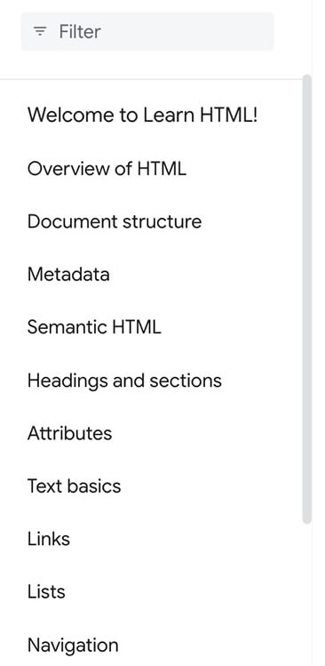
The next navigational component displays on most medium and larger size devices in a left sidebar, featuring a filter bar and links to each of the sections in Learn HTML. These links and the filter bar are the location navigation.
If you visit this site on a mobile device or otherwise have a narrower screen, when you load this page, the sidebar is hidden. You can access it with in the top navigation.
The primary difference between the permanent local navigation on wide screens and local navigation on narrower screens, is the arrow which leads back to the primary top navigation, then closes the navigation.
The link to this document looks the same as other links in the local navigation. However, it could have a slightly different appearance from the other links, To indicate to sighted users that this is the current page. This visual difference should be created with CSS.
The current page could also be identified with the aria-current="page"
attribute. This informs assistive technologies that the links is to the current
page.
Ideally, the HTML for this list item within local navigation would look similar to the following:
<li>
  <a aria-current="page" aria-selected="true" href="/learn/html/navigation">
    Navigation
  </a>
</li>
Global navigation
Global navigation leads to the top-level pages of the website and is the same on
every page of a site.
A site's global navigation may also be made up of tabs that open nested lists of links that link to all the subsections of a site or other menus.
It may include titled sections, buttons, and search widgets. These additional features aren't a requirement. What is required is that
the navigation appears on every page and is the same on every page, with aria-current="page" on any links to the current page, of course.
Global navigation provides a consistent means of traveling anywhere in the application or website. Google's website doesn't have global navigation at the top of its pages. Yahoo! does. While all the main Yahoo! properties have different styles, the content for most sections are the same.

The content of the news and sports global navigation headers are the same. However, the icon that shows the user is on the sports page doesn't have enough contrast to be accessible, even for visitors who have perfect vision. Both sections have a global navigation with a section-specific local navigation below it.

Similar to global navigation, footers should be identical on all pages. But that's the only similarity. Global navigation allows for navigation to all parts of the site, from a product perspective. Navigation elements within a footer don't have specific requirements.
Generally, the footer includes corporate links, such as legal statements, about the company, a career page, and links to relevant external sources, such as social media.
This page's footer contains two sets of navigation elements: a three column set of related web.dev navigation and a separate Google terms and privacy navigation. The footer navigation includes how to contribute to web.dev, related content provided by the web.dev team, and external social media links.
Up next, we'll look at marking up data tables.
Check your understanding
Test your knowledge of navigation.
Which element is used to mark up the main navigation of a site?
<navigation><breadcrumb><nav>There can be multiple navigation elements on one page?
